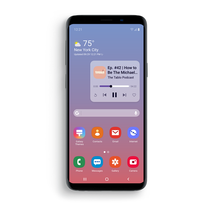
Designing an Android Widget: Learning as and challenging myself as a designer

I started learning how to use Adobe XD through their daily creative challenges; I would scroll through the older ones, pick one that piqued my interest, follow along with the video, and complete the challenge.
One of my favorite design challenges was the one where we use the stacks feature to design podcast widgets. This challenge came around the same time Apple released the iOS update where people can add widgets to and customize their home screens.

Instead of designing a widget for the iPhone, I decided to design one for Androids because I am an Android user. I also wanted to challenge myself more as I have never designed for an Android before this. I referenced Adobe XD’s Material Design UI Kit, a Samsung One UI kit I found on Behance, and screenshots of my home screen with various sized widgets to build my podcast widgets.
Since I don’t personally use widgets, I looked up podcast- and music-widgets available in the Google Play store to see common widget sizes were for such apps. I discovered that regardless of the height of the widget, the widget was always at full-width — the widget would take up a full row so that you cannot put apps to its left or right.
With this in mind, I designed two sizes of the podcast widget at full-width across the screen. I also designed one that did not go all the way across the screen so that the user could put an app next to the widget if they would like to do so. I decided to do this because I wanted to give the user more options when customizing their home screen.
In addition to creating three different widget sizes, I also auto-animated the track slider of the largest widget to show how you can drag the slider to “play” different parts of the podcast episode.

